2023 Wedding Colors
2023 Wedding Colors
If you’re in the thick of planning your own wedding, you’ll want something fun to do. Picking your wedding colors for your 2023 wedding is one of those fun things! And if you love to keep up with 2023 fashion/color trends, this is the task for you.
Picking your wedding colors allows you to just have fun and really let your personality shine through – your wedding colors will hopefully totally scream “you” to your guests when they arrive. If you need a few tips on how to get started with picking your colors, keep reading!
Match your wedding colors with your venue
If you don’t have any idea where to start picking colors – don’t stress. Pick some colors you like from the location your venue is in. Do they have a big beautiful garden with colorful flowers you can pick from? What about a scenic waterfront view or a luscious forest of trees? Draw inspiration from everything around your wedding and you will start to get an idea.
Your wedding venue likely has a very specific look to it, and there are definitely colors you can pick that will compliment it.
If your wedding venue is something rustic like a barn, warm colors will work beautifully.
If you’re having your wedding reception at a chic mansion, minimalist/neutral colors will be your best friend.
Having an outdoor wedding? Use the foliage and natural colors/textures as inspiration.
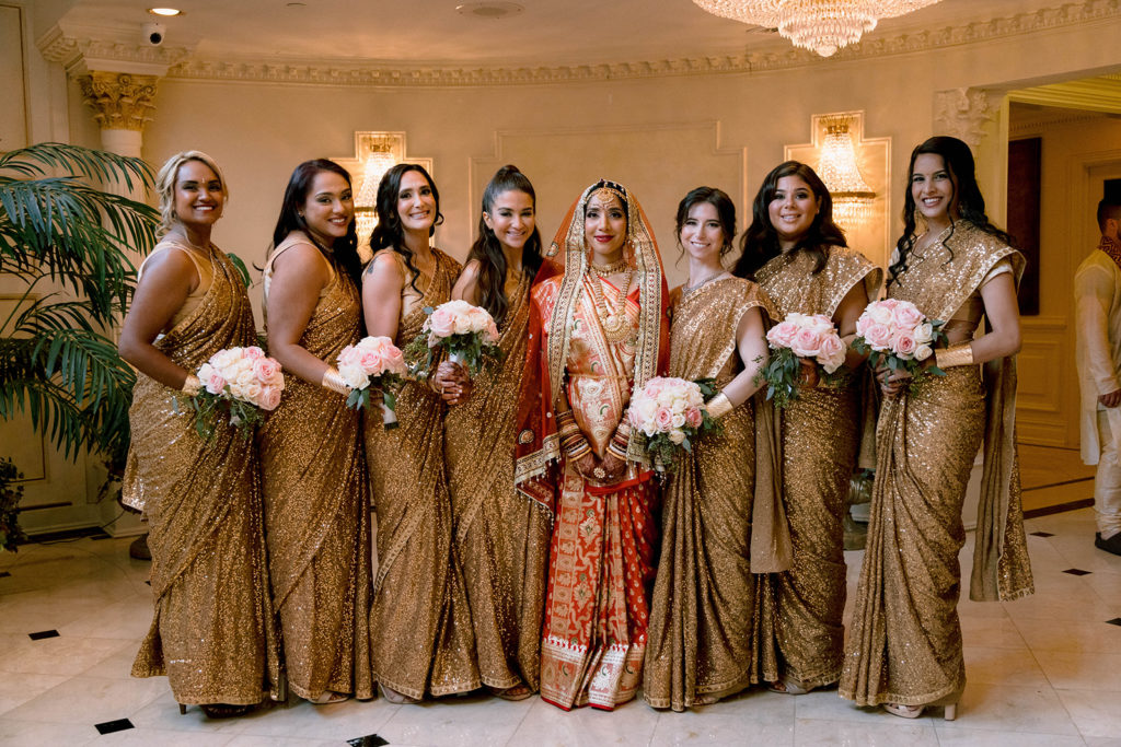
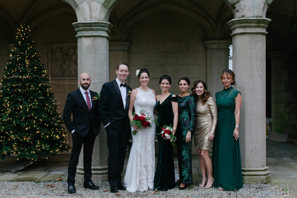
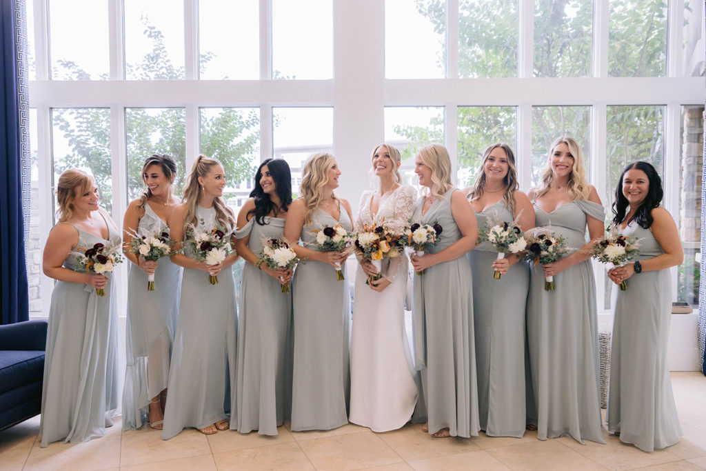
Matching your wedding colors to the season
If you have a winter wedding, you may be drawn to cranberry reds, deep blues and greens. If you have a spring wedding, you may be more inclined to pick from colors like pastel yellow, light pink or lilac. Have fun with it!
Colors and their meanings
I don’t know about you, but I could have written a multiple page paper about the underlying symbolism of the colors in Breaking Bad – no? just me? Moving on. Colors have a lot of meaning behind them, and if you’d like more info about that, you came to the right place.
Red – passionate, lively, and oftentimes used in restaurants to spark people’s appetites
Orange – fiery (duh) & warm, encouragement & enthusiasm
Yellow – happiness, excitement, energy & optimism
Green – life, nature, harmony & freshness
Blue – peace, calm, openness & wisdom
Purple – royalty, wealth, creativity & mystery
Pink – sweet, cute, playful & feminine
Black – power, elegance & sophistication
White – light, innocence, purity & perfection
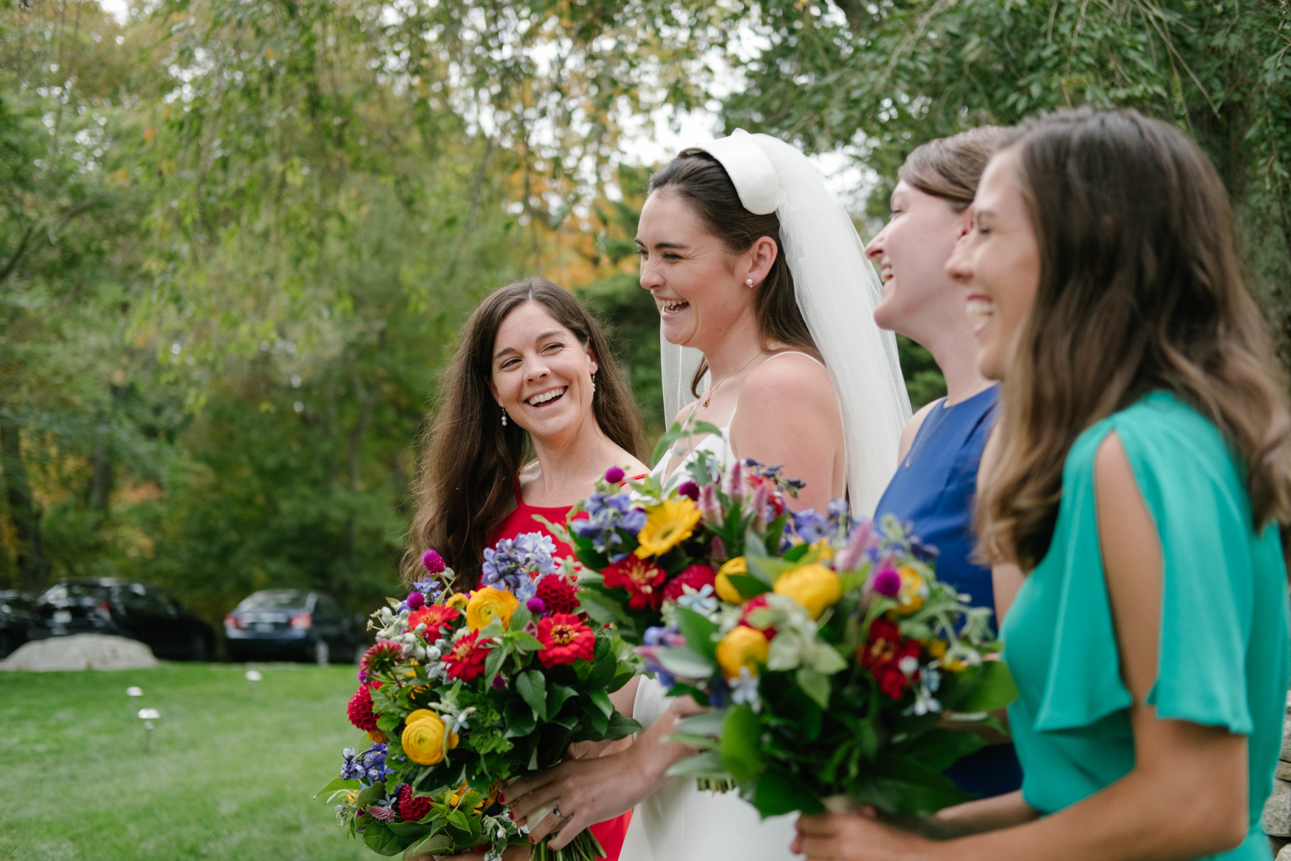
Complimentary colors reign supreme
After majoring in photography and taking mostly art-related classes we feel obligated to tell you the following: Complimentary colors ROCK and look great in photos. Complimentary colors are colors that are opposite each other on the color wheel; purple and yellow, red and green, blue and orange.

To wrap this up so you can get to work on picking your colors, here are some final quick tips:
- Have a favorite color? Amazing – pick that.
- Draw inspiration from textures
- Only like one color? Ombre everything.
- Neutrals need love, too
- Consider some classics
- Think about your favorite stores and brands — what colors do they use the most?
Weird bonus tip: if you have a super-ultimate-favorite movie of all time – pay attention to the cinematography. The color palette may inspire you, plus most directors have their own “palette” (Scorsese = bright, Fincher = dark, Anderson = neutrals).
At the end of the day, this is something to really have fun with. Don’t think too hard, but make sure you LOVE whatever colors you choose!
Good luck 🙂
References:
jump to end
Pricing Guide
FREE DOWNLOAD
Need something tailored more specifically to your wedding day needs? Let us know.


